

Redesigning an AI investing app to build
long-term investors
Behavioral design grew funded accounts from fewer than 200 to over 15,000, reframing how the app presented time, risk, and choice
ICONTEXTAI-managed hedge funds for anyone
Q.ai built AI-managed portfolios for people who had never had access to a hedge fund. No account minimums, no management fees, just algorithmic funds run through a phone. The models performed, returning above the benchmarks the team measured against, and the product promised institutional-grade investing to a consumer market that had always been priced out of it.
II
31 of every 1,000 sign‑ups became investors
CHALLENGEStrong performance, few investors
The funds outperformed the S&P 500, MSCI World, and smart-beta ETFs, yet the app held a 3-star rating and a 3.1% funding rate. Reviews called the interface clunky and slow, or dismissed it as one more trading app. Those were the visible problem; the bigger one was the silent churn of users who looked and left without funding.
The brief was to trace where people dropped off, find the cause, and raise funded-account conversion. The CEO set the target at 5 percent.
IIIDISCOVERYThe interface trained a day-trading reflex; the product rewarded patience
Q.ai's interface trained people to act like retail traders when the product needed the patience of a wealth manager. Interviews, session replays, and App Store reviews pointed to the same root cause, and the quant data confirmed it: users looped between funding, kit browsing, and reallocation screens without ever landing on a funded account.

The legacy UI defaulted to daily views and red-green ticks, signaling that immediate action was needed when the AI engine and fund structure left nothing to act on.Trading-app patterns set the wrong mental model, and users liquidated on normal dips
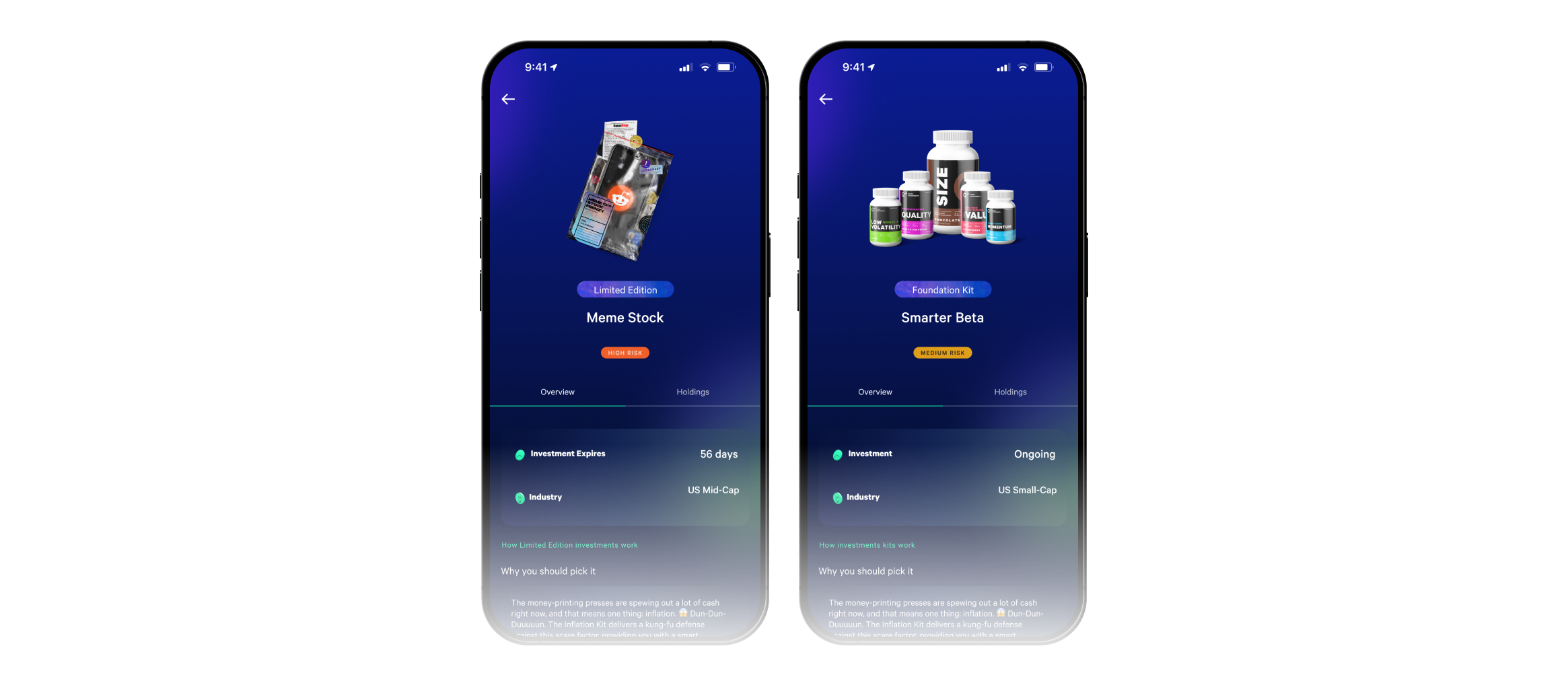
Supplement-bottle art made Smarter Beta read as playful instead of as the platform's best-performing kit.Users read the visual metaphors literally and missed the value underneath
The imagery worked against the product. Smarter Beta was the highest-returning kit, but its supplement-bottle illustration led users to assume it held fitness and wellness stocks. They rarely added it, and the platform's strongest option stayed hidden behind its own packaging.
“The UI cues, copy, and metaphors set the wrong expectations, broke the workflow, and buried what made Q.ai better.”
The cues taught a trading reflex, and fixing it meant reframing how the app presented time, risk, and choice, starting from the first tap.
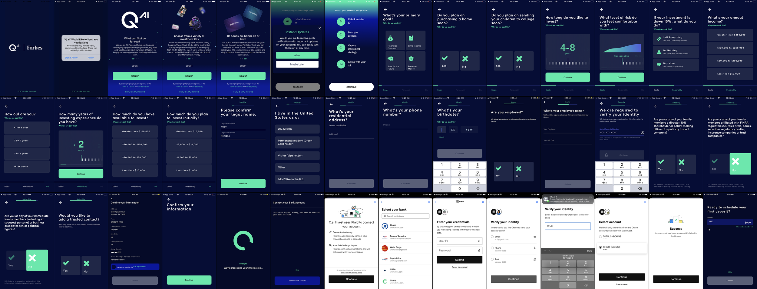
The patterns were borrowed from apps users already knew, with one-day and one-week tabs, red-green ticks, and dollar amounts first. Those cues told people to act now. Q.ai's mechanics ran the other way, on kit mixes, T+2 settlement, and weekly rebalancing. The interface matched old habits rather than how the product worked, and that mismatch produced confusion, anxiety on daily dips, and fast liquidations.

Vague yellow alerts signaled danger instead of progress—and offered no next step.Dead-end alerts broke trust
Communication failures compounded the mismatch. Banners flashed Action required with no way to clear the KYC check. Funding loops broke without explanation when Plaid timed out. The app never said why trades settled on T+2. Users hit dead ends, blamed the product, and left.
IVDesign the experience around operational constraints, then refine the UI to shift user behavior.
The interface had to functionally align to real operations with clear visual patterns. Once that held, I could refine the UI to guide users toward institutional practice and the app's real value: AI-managed investing.
I designed for one behavior above all: set it and forget it.
STRATEGYV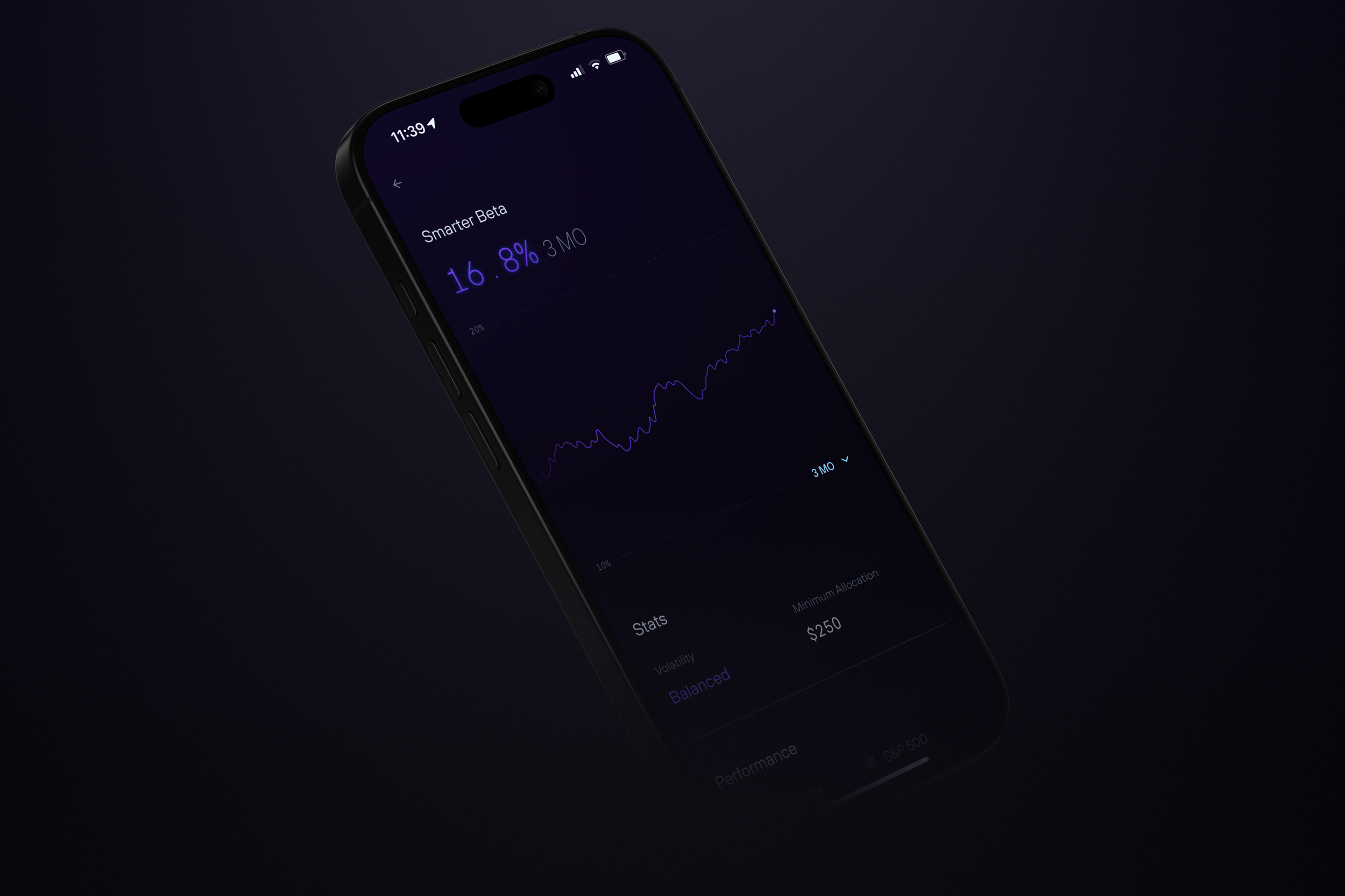
Product Design
PRODUCT DESIGNDesigning the app around diligence over reactive instants.
The redesign reworked the app from the first tap forward. Screens, labels, and timing were set to clarify risk volatility and move users toward funded, goal-based portfolios. The pieces work as one behavioral system: the logic that shapes how users act sits under an interface that stopped sounding alarms.

The onboarding quiz captures timeline, income, volatility comfort, and goals, then turns the answers into a strategy and a target.Onboarding set the throughline. The answers fed the AI engine, which returned a plan, a proposed goal, and a strategy before the user reached the dashboard. When inputs conflicted, the plan recalculated on the spot, so the user always saw a current, specific recommendation rather than a blank slate.

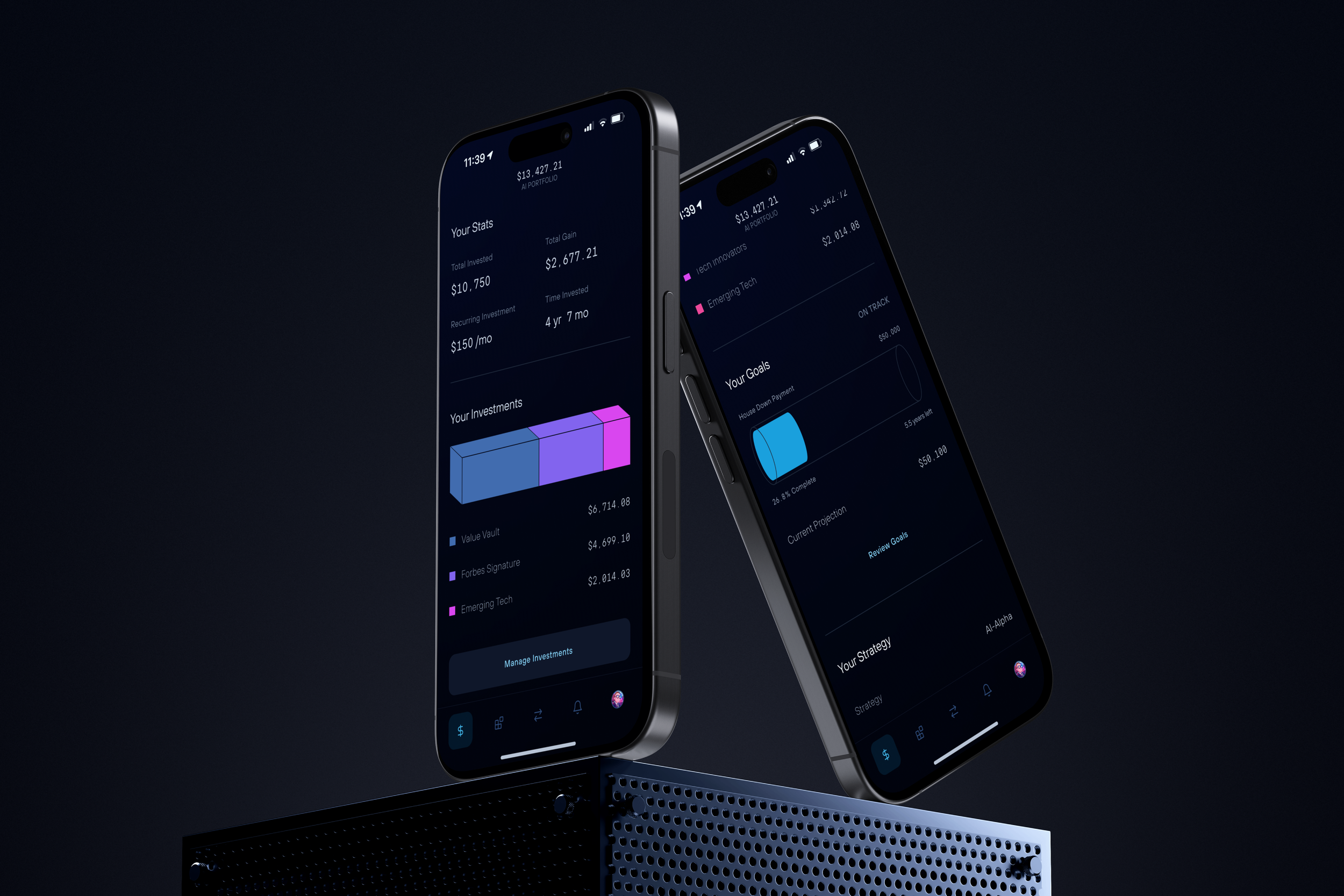
A 90-day curve, a goal tube, and a dotted projection replace the day-trader's minute-by-minute spikes.The dashboard puts time at the center defaulting to a 90-day view. Four numbers anchor the view: amount invested, current value, monthly contribution, and progress toward the goal. A tube-style bar fills toward the target and a dotted line projects where the balance is heading, which pulls attention toward the horizon instead of the day's move.
The app led with the user's own portfolio and held everything else back. Additional strategies appeared only when they fit the stated goal, which kept the choice set small and relevant and the user out of the browsing loop that used to end in liquidation.
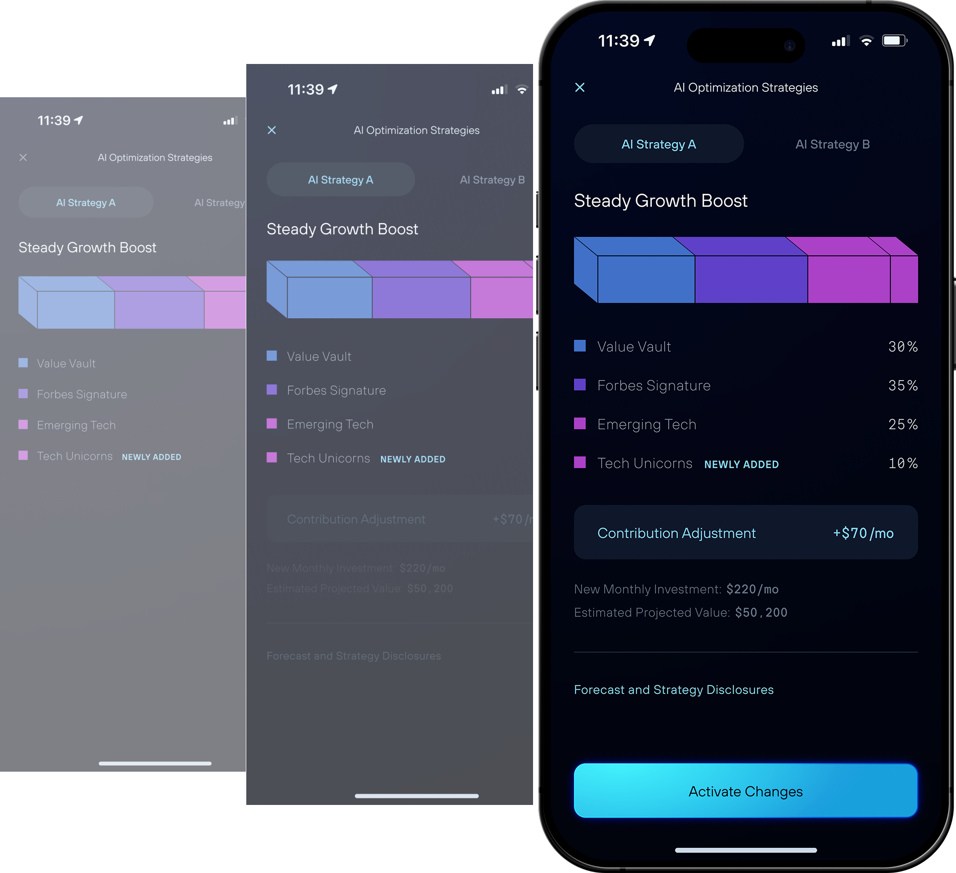
The contribution card fades in 0.4 seconds after the optimization overlay, so the user reads one thing at a time.When a projection fell short of the goal, the app showed what would close the gap: adding a kit like Tech Unicorns for more growth, or raising the monthly contribution by $70. It stated the trade-off in plain numbers, for example that a $50,200 target needed $220 a month at a given mix. The user could take the recommendation, lower the goal, or try another strategy, and each choice recalculated immediately so the projection always matched the current inputs.

Steady, Balanced, and Growth replaced risk language, each with a plain label and a color badge.Risk → Volatility
The language changed to describe the kit, not the user. Risk became investment profile, and the three strategies were labeled by how they move: Steady for predictable growth and lower volatility, Balanced for most goals, Growth for ambitious targets and larger swings. Volatility replaced risk throughout, so a user choosing Growth knew it meant bigger moves in both directions and chose it on purpose rather than reacting to a fear word.

Projections framed each kit against the user's own goal, not the market's.The kit details page replaced buy buttons and ticker symbols with a personal projection, for example that $500 in Smarter Beta could reach $1,178 in five years. Adding a kit took one tap, with no order types or share math; Add to AI Portfolio handed rebalancing, allocation, and settlement to the system. The supporting data, including volatility profile, holdings, and benchmark comparison, all answered the same practical question of how the kit moves the user toward the goal the AI had already matched it to.

The app suggested a funding amount tied to goal progress, for example that $250 would keep the user on trackRepeat funding ran on remembered preferences. After setup, the app pre-selected the user's usual amount and payment method, so a deposit took one tap. The old flow lost people at the moment they had decided to fund, when an expired Plaid token forced them to start over. APEX cleared the bank verification in the background while a debit-card path funded the account immediately, so a user could fund by debit while the connection finished or move between the two.
VIIMPACTUsers funded accounts and held them
Funding conversion rose from 3.1% to a peak of 22.7% and settled at 13.9%. Liquidations fell as the interface stopped manufacturing urgency, and users followed the guided strategies onboarding had set. Average first funding passed $500 within the first 60 days, which read as commitment rather than a trial deposit. The redesign changed financial behavior through the framing of time, risk, and choice rather than through added persuasion or education.
3.1% → 13.9%
Conversion to funded accounts
$500+
Average funded amount in the first 60 days
15,000+
Funded accounts in ~8 months
VIICREDITSFOUNDER & CEOSR. PRODUCT MANAGERPRINCIPAL PRODUCT DESIGNERStephen Mathai-Davis
Zachary Tobin
Aaron Smith
Dedicated to an investing legacy
In Memory of Stephen Mathai-Davis (1982–2022)